
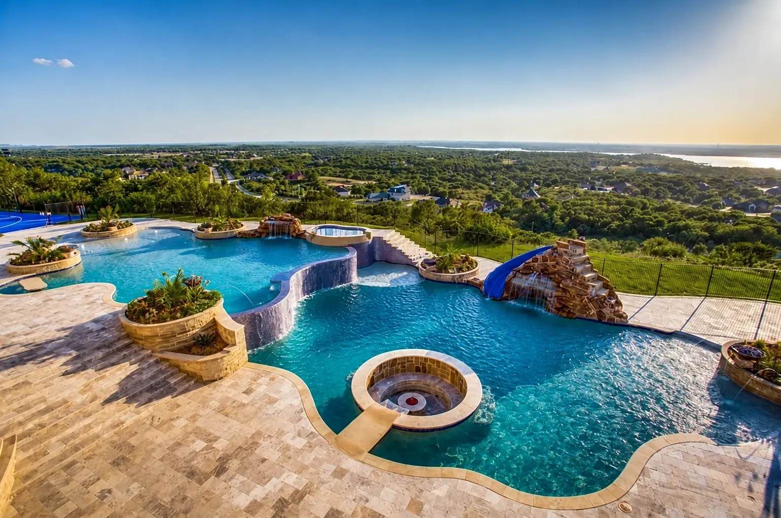
Choosing pool colors is not as simple as selecting a blue sample from a catalog. The interior finish, water depth, sunlight, waterline tile, coping, decking, house exterior, landscaping and nighttime lighting all affect how the completed pool will look. The strongest North Texas designs build one coordinated palette instead of selecting every material separately.
Start with the water color you want
The interior finish has the strongest influence on perceived water color, but it is not the only influence. Pool depth, sunlight, shadows, surrounding materials and reflected landscaping can all change the appearance.
A light finish generally creates a brighter, more traditional blue. Medium-blue and gray finishes can create a deeper resort-style appearance. Very dark finishes can look dramatic, but their appearance should be reviewed in full sun, shade and evening lighting before approval.
Manufacturer photographs are useful for narrowing the choices, but they should not be treated as exact color promises. NPT advises customers to inspect an actual product sample because colors shown online can differ from installed materials.
- Review a physical finish sample in daylight
- Compare completed-pool photographs at several water depths
- Place the finish beside the proposed waterline tile and coping
- Look at sunny and shaded installations
- Decide whether the goal is bright, natural, contemporary or dramatic
Coordinate the pool with the house
The home should establish the starting point for the palette. Look at its brick, stone, stucco, roof, trim and metal accents before selecting pool materials.
A warm brick or Texas-limestone home will often relate naturally to cream, buff, tan and softly blended stone colors. A modern white, gray or painted-brick home may support silver, charcoal and cleaner blue-gray combinations. Mixed-material homes frequently look most intentional when one existing architectural color is repeated around the pool.
Repeating a color does not mean matching every surface exactly. The goal is to create a visual connection without making the backyard look flat or allowing several strong materials to compete.
Three useful North Texas pool palette directions
A light-limestone resort palette combines a medium-blue interior, restrained blue or blue-gray waterline tile, and light cream, limestone or travertine tones around the pool. This direction can work especially well when the house already contains light masonry. Structured green landscaping and warm-white lighting complete the setting without adding unnecessary color competition.
A modern silver-and-blue palette combines a clean blue or blue-gray interior with silver-gray coping, a simple waterline tile and a restrained deck pattern. Limit the number of competing colors and use texture to distinguish the pool edge, deck, raised spa and feature walls. Dark charcoal can provide contrast as an accent, but large uncovered dark surfaces deserve careful heat-comfort review in North Texas sun.
A natural Texas-stone palette can use Buff Lueders or similar familiar stone tones, an earth-toned or softly variegated waterline tile and a blue interior finish. Natural stone is not limited to freeform pools; it can soften a geometric pool and connect it to brick, ranch-style or transitional architecture.
- Light limestone resort: open, relaxed and softly coordinated
- Modern silver and blue: restrained color with cleaner contrast
- Natural Texas stone: regional materials with controlled variation
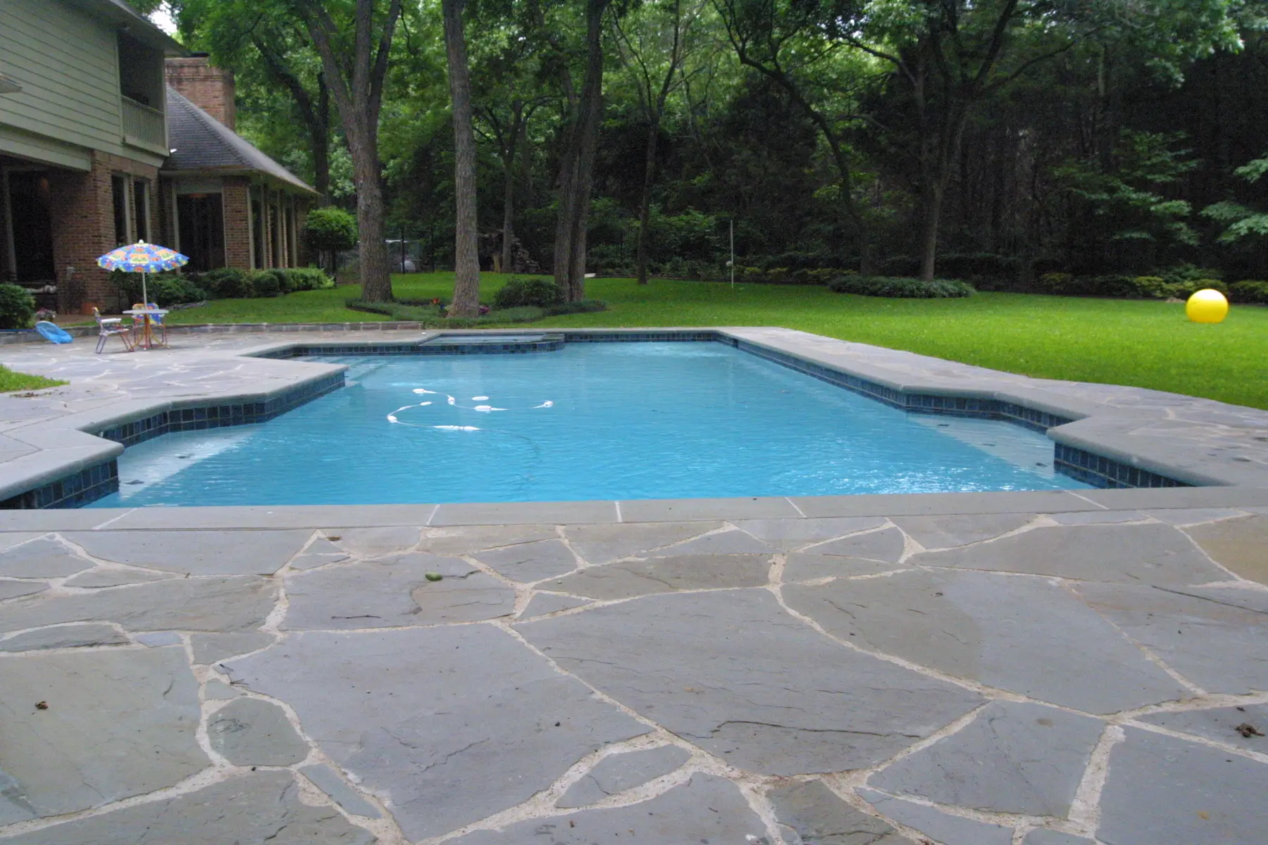
Treat the coping as the transition piece
Coping is the visual bridge between the water and the deck. It defines the pool outline, so its color and edge profile carry more visual weight than a small showroom sample suggests.
A contrasting coping can create a strong outline. A coping color close to the deck creates a quieter, more seamless appearance. Neither approach is automatically better; the right direction depends on the home, pool geometry and intended style.
For raised walls or water features, select the vertical material at the same time as the coping. That helps prevent individually attractive materials from looking unrelated once they are repeated across the finished pool.
- Relationship to the home masonry or trim
- Contrast against the waterline tile
- Appearance when wet
- Texture and barefoot comfort
- Edge profile, joint pattern and future replacement availability
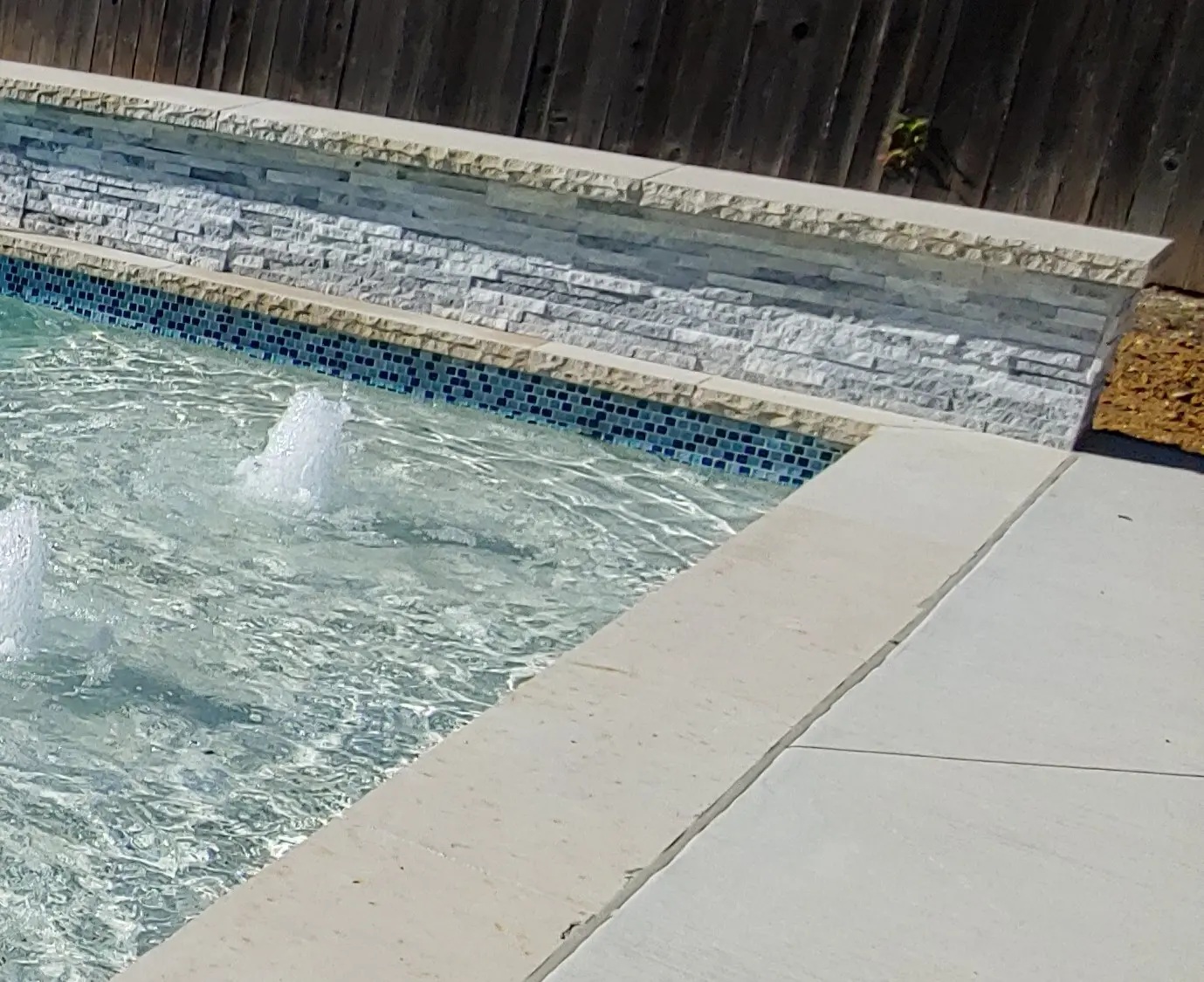
Keep the waterline tile disciplined
Waterline tile is one of the easiest places to introduce too many colors. A tile may look subtle on a sample board but become much busier when repeated around the full perimeter of the pool and spa.
A practical approach is to select one dominant color and no more than one or two secondary tones. If the interior finish already contains significant color or movement, a quieter tile often provides better balance.
Six-inch waterline tile creates a defined, serviceable band at the waterline without overwhelming the rest of the design. Decorative tile can then be reserved for intentional accents instead of competing around every edge.
Design the deck for appearance and use
The deck is usually the largest uninterrupted material area in the backyard. Its color can influence how spacious, bright and comfortable the complete pool environment feels.
Review deck samples outdoors under afternoon sun and after they are wet. Color alone does not establish surface temperature or safety. Material, texture, installation, exposure and project-specific slip-resistance documentation all belong in the final decision.
For commercial pools and HOA amenity centers, the approval package should record the manufacturer, color, finish, size, layout and acceptable substitutions. Required markings, contrast and accessibility details should be coordinated separately with the project designer and applicable authorities.
- Color in full afternoon sun
- Texture and documented wet-surface performance
- Drainage and grade transitions
- Furniture, grilling, serving and traffic locations
- Maintenance, repair and matching-material availability
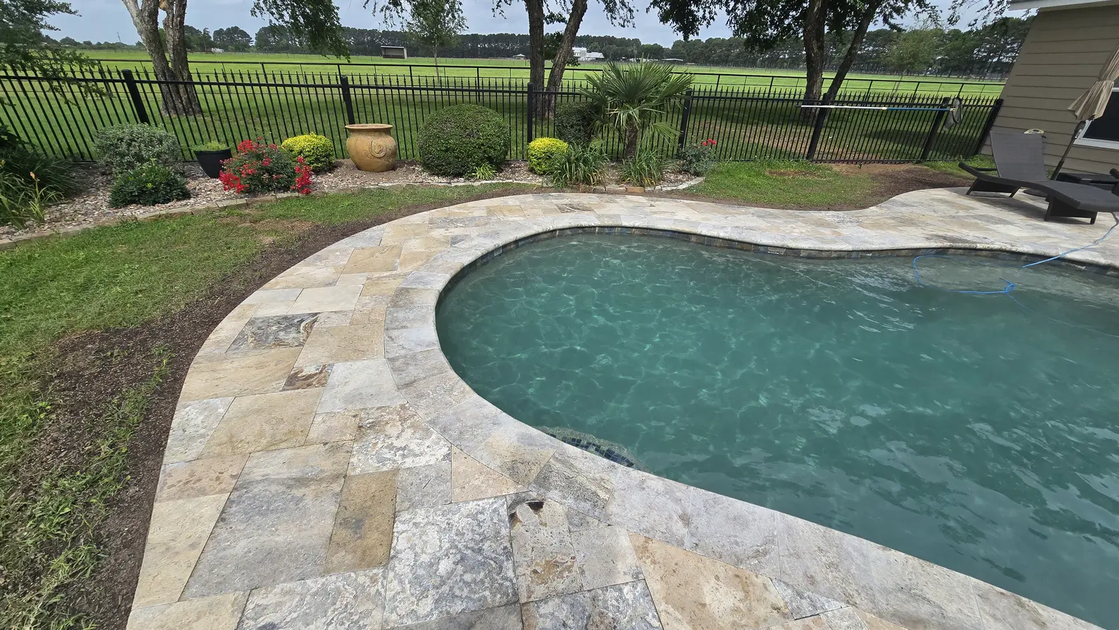
Add lighting after the daytime palette is settled
Lighting should reveal the materials, steps, landscaping and water features without overpowering them. DarkSky responsible-lighting guidance emphasizes useful, targeted light with controlled brightness and warmer color where appropriate rather than unnecessary glare.
Pool lighting should be reviewed with the selected interior finish. The same light can appear different in a pale-blue pool than in a deeper gray or blue finish. A completed combination should be reviewed in daylight and after dark whenever a suitable reference project is available.
Coordinate pool lights with paths, steps, cooking surfaces, structures and landscape lighting so the nighttime backyard reads as one environment instead of a collection of disconnected bright spots.
Use landscaping to complete the palette
Pool landscaping should reinforce the architectural direction while accounting for mature plant size, maintenance, irrigation and debris near the water.
Texas SmartScape provides a North Central Texas plant database that can be filtered by sunlight, water demand, mature size, ornamental color and landscape purpose. Native and adapted plants can help build a landscape around local soil, climate and precipitation instead of relying only on a photograph from another region.
A restrained planting palette usually produces a cleaner result. Repeat a small number of dependable plants, use evergreen structure near primary views, and place seasonal color where it will not interfere with pool traffic or maintenance.
- Keep thorny plants and high-debris trees away from the water
- Plan for mature height and spread instead of installation size
- Keep irrigation overspray off the pool and deck where practical
- Coordinate planting colors with the house and hardscape
Make one material board before final approval
Before ordering materials, place the actual interior-finish, waterline-tile, coping, deck and wall samples together. Review them outdoors beside a photograph or sample of the home exterior.
For a commercial project, turn the approved combination into a written finish schedule. For a residential project, photograph the accepted material board and retain the manufacturer names, product names and color numbers.
This final comparison helps the pool, spa and outdoor-living area look like one planned environment. It also gives the builder, owner and project team a clearer record if a selection becomes unavailable or a later repair needs matching material.
- Interior finish and expected water-color direction
- Waterline tile and any accent tile
- Coping material, color and edge profile
- Deck and vertical-wall materials
- Approved product details and substitution process
Common questions
Frequently asked questions
What determines the color of swimming-pool water?
The interior finish has the strongest influence, but depth, sunlight, shade, surrounding materials, landscaping, water conditions and lighting can all affect the color a person sees. Review physical samples and completed installations rather than relying on one screen image.
Should pool coping match the deck?
It can, but it does not have to. Similar colors create a quieter and more continuous edge, while contrast outlines the pool more strongly. The choice should relate to the house, waterline tile, pool geometry and intended style.
Are light pool-deck colors always cooler?
Color can influence solar heat absorption, but it does not determine surface comfort by itself. Material, texture, exposure, installation and local conditions matter. Compare the actual proposed surface outdoors rather than relying on a color name alone.
How many colors should a pool palette use?
There is no universal number, but one dominant direction with a small number of supporting tones is easier to coordinate than several equally strong materials. Texture can create distinction without adding another competing color.
Should commercial pool finishes be approved differently?
Commercial and HOA projects benefit from a written finish schedule that records manufacturers, product names, colors, sizes, layouts and acceptable substitutions. Safety markings, accessibility, code and wet-surface requirements still need project-specific professional and authority review.
Next step
Compare the complete material palette before you commit
Browse King Pools finishes, tile, coping, decking and wall materials, then start a preliminary estimate or request a property-specific North Texas design conversation.